Anyone who has watched an AI tool turn a two-line prompt into a neat set of screens knows the feeling. It's impressive for about thirty seconds. Then the real questions arrive. Does this flow make sense for a first-time user? Where does the user go if they make a mistake? Will this layout survive contact with real data?
That gap, between a layout that looks right and a layout a team can build from, is what this post is about. It walks through a workflow for getting a usable wireframe out of AI, treating the process the way developers treat a spec and a code review: define the input carefully, generate options, review before polishing, and test before you commit.
What is a usable wireframe, and how is it different from a good-looking one?
A usable wireframe communicates structure, flow, and hierarchy clearly enough for a team to make decisions and move forward. A good-looking wireframe only has to look good. The two overlap, but they aren't the same thing, and AI tools make it very easy to produce the second without the first.
A usable wireframe has a clear content hierarchy, a logical path between screens, defined user actions, room for real content, and short notes on behavior and intent. It also leaves room to change. Wireframes exist so that changing your mind is inexpensive, and a version so polished that nobody wants to touch it defeats the purpose.
Why are product teams adopting AI for wireframing so quickly?
The AI in Design 2026 report from Designer Fund and Foundation Capital surveyed 906 designers and found that 91% use AI at least weekly, up from roughly 54% a year earlier. That kind of jump usually means a tool has removed a specific pain, not just added a feature.
The pain here is the blank canvas. Early-stage design is full of small, loaded decisions: where navigation lives, what goes above the fold, how many steps a flow should have. Starting from nothing makes every one of those decisions feel heavy. Starting from a draft turns them into reactions, and reacting is faster and less stressful than inventing.
There's a second reason, and it's more interesting. When a first draft takes minutes, production stops being the scarce resource. Judgment becomes the scarce resource. Teams want a process that makes decisions visible: options side by side, structure reviewed before style, and a record of why something was chosen. That's the same reason spec-first and architecture-first approaches are gaining ground on the engineering side. Platforms like 8080.ai, for example, generate a system requirements document and architecture diagrams before code generation begins, so the structural decisions can be reviewed while they're still easy to change. A wireframe does the same job for the interface.
How do you write a brief an AI tool can work with?
Treat the brief like a lightweight spec. The tool can only work with what you give it, and a vague request produces a vague layout. A strong brief covers the product or feature, the target user, the core job to be done, the key screens, the primary action on each screen, any constraints, and the content or data the screens need to hold.
Here's what that looks like for a fitness app's onboarding flow:
Product: Mobile onboarding for a fitness coaching app
User: Busy professionals
Goal: Finish a three-step profile setup
Screens: Welcome, goal selection, schedule
Primary action (each screen): Continue
Constraint: No more than three taps to finish
Output: Low-fidelity wireframe, structure and flow only
And a template you can reuse:
Create a low-fidelity wireframe for [product or feature] for [target user].
The goal is [job to be done]. Include [screens].
The primary action on each screen is [action].
Focus on structure and flow, not visual style.
The final line is easy to overlook, but it does real work. Asking for low fidelity keeps both the tool and the reviewers focused on structure instead of color, imagery, and typography that nobody has agreed to yet.
Why should you generate several layout directions instead of one?
Because the first output is just one possible answer. Ask for three to five variations and you'll see trade-offs that a single draft hides: a card-based layout next to a list-based one, different navigation patterns, different groupings of the same content, a dense version next to a sparse one, and a mobile structure next to a desktop one.
Prompts that tend to work well are simple and specific. "Show three layout variations for this dashboard." "Explore a card-based and a list-based version of this screen." "Give me a minimal version and a content-rich version." The goal isn't volume. It's comparison. Choosing between drafts produces better decisions than polishing one, and it gets a team to agreement faster because the discussion is about concrete alternatives instead of abstract preferences.
How should you review an AI-generated wireframe?
Review it the way you'd review a pull request: for logic first, style later. Resist the urge to comment on how it looks. At this stage, the questions that matter are about structure and flow.
- Can someone tell what each screen is for within a few seconds?
- Is the primary action obvious on every screen?
- Does the flow move in a logical order, with no dead ends?
- Is there room for real content, including long names, empty states, and error states?
- Is anything missing, and is anything redundant?
A practical trick is to walk through the whole flow in order, as a specific user with a specific goal, tapping every element. Screens that look complete but offer no clear next step or way back tend to jump out immediately when you do this, and they're easy to miss when scanning a set of screens side by side.
What should a person refine before it goes any further?
This is the step where design judgment replaces generation. Refine the visual hierarchy, spacing and padding, alignment, content grouping, label wording, and the placement of primary actions. In practice that usually means moving the main action higher, grouping related items, adding breathing room, rewriting vague labels, and removing anything that doesn't earn its space.
These changes make the wireframe easier to scan and easier to interpret for people who weren't part of the earlier discussion. They also set up a cleaner transition into high-fidelity design, because the structure is already settled.
How many people do you need to test a wireframe with?
A wireframe isn't finished until someone who didn't create it can use it. Nielsen Norman Group's long-standing guidance is that a first round with five participants uncovers about 85% of the usability problems in a design. The advice that follows is to fix what you find and test again with a new set of people, rather than running one large study.
The same source includes caveats worth remembering. Finding every problem takes closer to 15 users overall, and a product with clearly different user groups needs testers from each group. For an early wireframe, though, five people is a practical, proportionate starting point.
Keep the session simple. Give each person a task instead of a tour, watch where they hesitate, and write down what confuses them instead of explaining it away. A moment of hesitation in a wireframe is useful information you can act on in minutes. The same hesitation in a shipped product is a support ticket.
What happens after the wireframe is approved?
This is where many wireframes quietly lose value. The layout is signed off, and then the people building it reconstruct the intent from memory, missing the decisions that shaped it. A good handoff carries the final flow, notes on behavior, content requirements, edge cases, and a list of open questions.
Teams are also looking for ways to shorten the distance between an approved design and working software. One approach is to carry the same structure-first discipline into the build. 8080.ai, as it describes in its own write-up on architecture-first development, starts from a requirements document and multi-tier architecture diagrams, then runs specialized agents across frontend, backend, infrastructure, and testing in parallel. Whatever approach a team chooses, the principle is the same: the clearer the plan is on paper, the less gets lost once building starts.
Where do AI wireframes still fall short?
They don't know your users, your compliance constraints, or the existing system your new screen has to coexist with. They can propose flows that look entirely reasonable and still violate a business rule that only your team understands. Accessibility, edge cases, and error handling usually need an explicit human pass.
None of that makes the tools less useful. It defines their role. AI is excellent at exploration: variations, structures, and first drafts that give a team something concrete to react to. People remain responsible for judgment: deciding what's right, testing it, and owning the intent behind it.
Putting it together
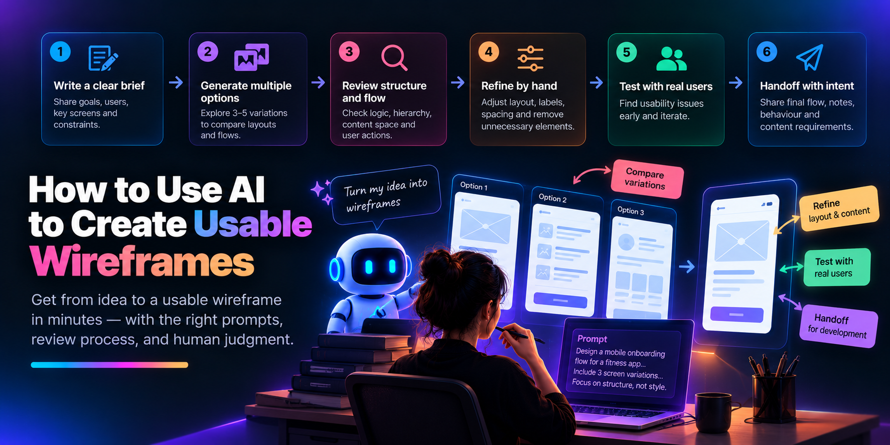
A usable AI-assisted wireframe comes from a repeatable sequence. Write a clear brief. Generate several directions. Review structure and flow before style. Refine hierarchy and spacing by hand. Test with a handful of real users. Hand off with intent attached. Each step is small. The result is a layout your team can decide on, build from, and change with confidence.
Comments
Join the discussionNo comments yet. Be the first to comment.